explain.anayrat.info
PostgreSQL's explain analyze made readable
Help
explain.depesz.com is a tool for finding real causes for slow queries.
Generally, one would use the EXPLAIN ANALYZE query; and read the output. The problem is
that not all parts of the output are easily understandable by anybody, and it's not always obvious
whether a node that executes in 17.3ms is faster or slower than the one that runs in 100ms - given the
fact that the first one is executed 7 times.
To use the site, simply go to first page and paste there explain analyze output from your psql.
After uploading, you will be directed to a page which shows parsed, and nicely (well, at least nice for me :) colorized output, to emphasize important parts.
The url for colorized output is persistent, so you can easily show it to others. For example to those nice guys on the irc channel #postgresql on freenode.
Meaning of columns in HTML view
While viewing HTML view, which is the default, you will be shown a table like this one:
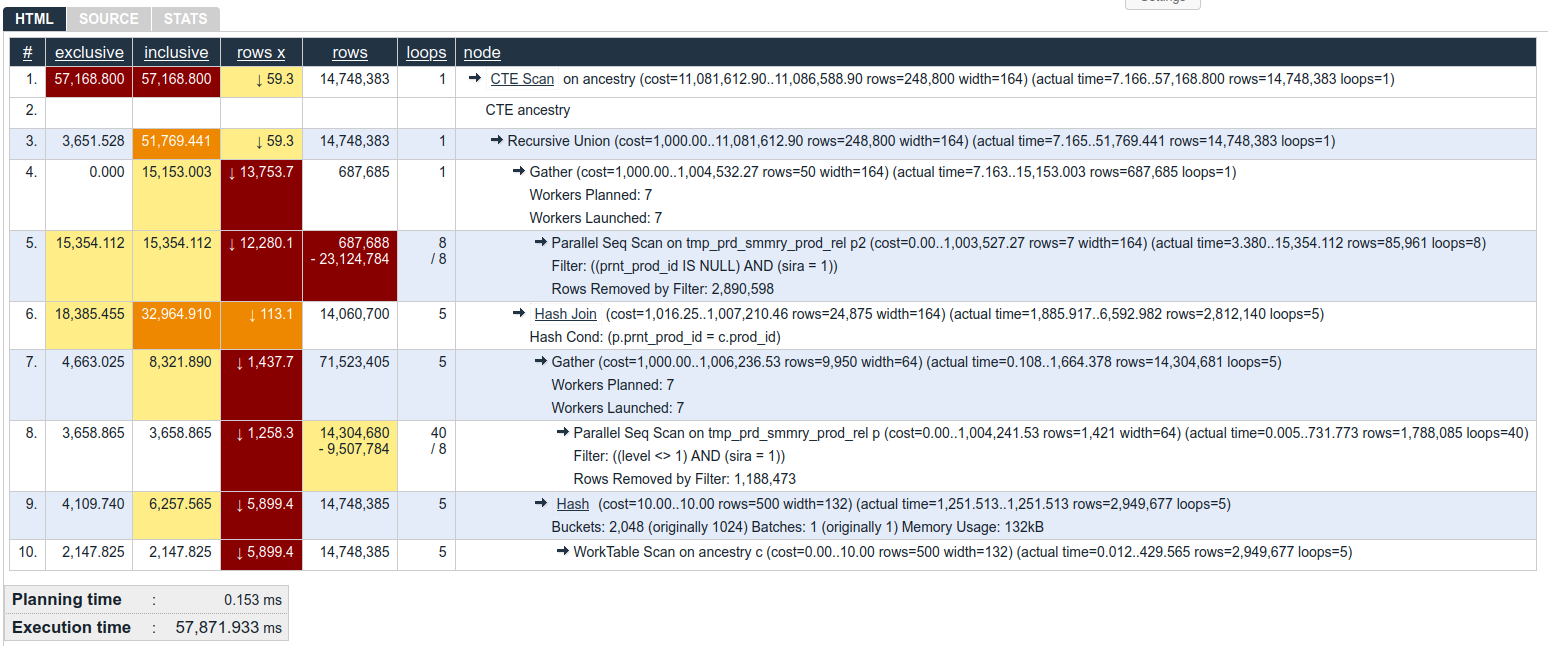
In there you have following columns:
Column: #
Simple node number for given node. The number itself is a link that you can share to someone to point to this specific part of explain.
Column: exclusive
How long did it take PostgreSQL to process this single node, but without time spent on any sub nodes. So, we can see that, in line 9, Hash used 4.1 seconds just do its work over rows provided by WorkTable Scan in line 10.
Please note that this number takes into account how many each process had to be run - This Hash was ran 5 times (value in loops column), so, each Harsh took only ~ 800ms. But in total, they took 4.1s.
Information about meaning of colors: click here.
Column: inclusive
This is similar to exclusive column described above, but this includes time spent by all sub nodes.
So, in our example, inclusive in Hash in line 9 is ~ 6.2 seconds, because it sums 4.1 second from Hash itself, and 2.1 seconds from WorkTable Scan in line 10.
Information about meaning of colors: click here.
Column: rows x
When planning how to run a query, PostgreSQLs is basing its decisions on statistics. You can see that it estimates some number of rows that will be returned for given node in (cost=... rows=!!! part of node description. For example, for Hash in line 9, it estimated that it will return 500 rows.
But sometimes/often the actual number is different. No stats are perfect. No assumptions are perfect. We can see the real number of rows returned in (actual time=... rows=... part, and also in rows column.
Difference between estimate and reality can be a problem. Rows X shows how many times the planner under- or over- estimated number of rows in given now.
Values with ↓ mean that planned underestimated by given number of times, and values with ↑ would mean that it overestimated.
For example, WorkTable Scan in line 10 - PostgreSQL estimated that it will return 500 rows, but in reality it returnes almost 3 million rows. So Rows X shows ↓ (2,949,677 / 500 ) ~~ 5899.4.
Information about meaning of colors: click here.
Column: rows
How many rows this node actually returned. In case given node was run in many times, it's average returnes rows per loop.
In our example, WorkTable Scan in line 10 returnes, on average, 2,9 million rows, within 5 loops. So, in total, it returns ~ 14.7 million rows.
In another case, Parallel Seq Scan in line 8, reports that it returnes 1,788 million rows, within 40 loops. But this was with 8 concurrent workers, and in such case, rows shows number of rows (on average) per worker. So real, total, number of returned rows, is 8 * 1,788 million which is a bit over 14,3 million.
Sometimes you will get there also "-" character, and a number, for example like in lines 5 and 8, both being Parallel Seq Scan.
This information means that while processing this node, PostgreSQL got from sub-node, or from data some rows that it had to discard because of some kind of condition.
Usually you don't have to worry about it, but if you'd see Seq Scan which returns tiny fraction of removed rows - it might be good place to look for index.
Information about meaning of colors: click here.
Column: loops
This columns tells us how many times given node was run. For example, WorkTable Scan in line 10 was ran 10 times. And Parallel Seq Scan from line 8 was ran 40 times.
There is a bit more info here, though. We know (from Gather node in line 7) that the Parallel Seq Scan in line 8 was run in 8 concurrent workers. Which means that really, each worker only ran 40 / 8 = 5 loops.
This information is also present in loops column. Whenever you see there number_a "/ character" number_b it means that there were really number_a loops, but ran within number_b worker processes.
Column: read
This is shown only if your explain used buffers option, and shows how many bytes were read from disk (or system disk cache) by given node.
Column: written
This is shown only if your explain used buffers option, and shows how many bytes were written to disk by given node.
Please note that writes can also happen from plain read-only queries, as explained in this blogpost.
Column: node
This is textual representation of node, as close to original EXPLAIN (ANALYZE ON, FORMAT TEXT) format as possible.
Interactive use
While viewing explain in the html mode (the default one) you can switch to viewing source, reconstructed textual plan (if your plan was in json/yaml/xml format), and stats for the plan. To do so click on one of the tabs:

When hovering over plan, you might notice small stars, like this one:  . These mark nodes that are direct subnodes (children) of current node.
Additionally you can click on any node line, and it will fold all of its subnodes. For example, with plan like:
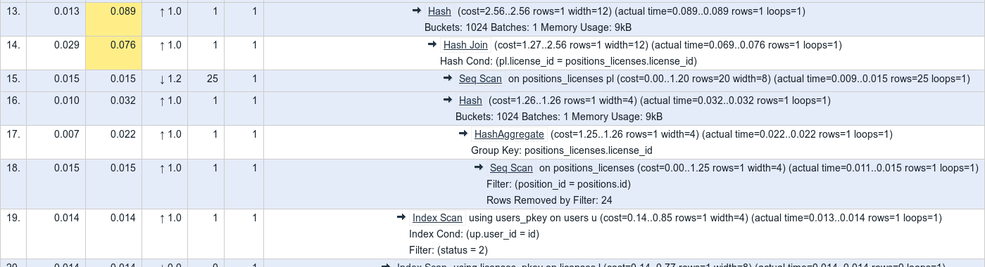
after you'd click on line 14, you'd get:
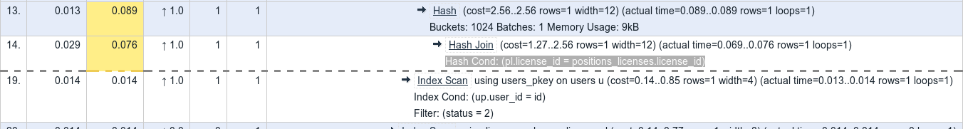
Clicking again on line 14 will unfold the lines.
Node types (for example: "HashAggregate", "Seq Scan" and others) are clickable, and will direct you to my description of this node type.
Embedding on another pages
It is possible to embed plan view on another page.
For example, let's assume you have a plan. In its link you can see that the plan id is nMS5. Knowing this you can add to your page:
<iframe width=800 height=200 src="https://explain.depesz.com/i/nMS5"></iframe>
Which will give you, on your site:
Reformatted query
If you'd paste query, it will be displayed, using pasted format, in QUERY tab. But it will also be passed through beautification process, and shown in REFORMATTED QUERY tab.
Beautification is done using pgFormatter library.
Colors
This graph uses 4 colors to mark important things:
- white background - everything is fine
- yellow background - given node is worrying
- brown background - given node is more worrying
- red background - given node is very worrying
The color is chosen based on which mode you use: "Exclusive", "Inclusive" or "Rows X".
Colors for column Exclusive
This is the total amount of time PostgreSQL spent
evaluating this node, without time spent in its subnodes. If the node has been executed many times (for example because
of a Nested Loop plan), this time will be correctly multiplied.
Colors:
- white background - is chosen if exclusive time <= 10% of total query time
- yellow background - is chosen if exclusive time ∈ (10%, 50%> of total query time
- brown background - is chosen if exclusive time ∈ (50%, 90%> of total query time
- red background - is chosen if exclusive time > 90% of total query time
Colors for column Inclusive
This is just like Exclusive, but it doesn't exclude time of subnodes. So, by definition the top node will have Inclusive time equal to the total time of the query.
Colors:
- white background - is chosen if inclusive time <= 10% of total query time
- yellow background - is chosen if inclusive time ∈ (10%, 50%> of total query time
- brown background - is chosen if inclusive time ∈ (50%, 90%> of total query time
- red background - is chosen if inclusive time > 90% of total query time
Colors for column Rows X
This value stores information about how big the planner's mistake was when it estimated the return row count.
For example, if planner estimated that a given node will return 230 rows, but it returned 14118 rows, the error is 14118/230 == 61.4.
It has to be noted that if the numbers were the other way around (estimated 14118, but really only 230), the Rows X would be the same. To show whether planner underestimated or overestimated - there is an arrow showing either ↓ - if planner underestimated rowcount, or ↑ if it overestimated.
Colors:
- white background - is chosen if rows-x <= 10
- yellow background - is chosen if rows-x ∈ (10, 100>
- brown background - is chosen if rows-x ∈ (100, 1000>
- red background - is chosen if rows-x > 1000
Colors for column Rows
This can be colored if there is LARGE number of removed rows.
For example, if there will be index scan on table, that will match 100 records, but additional (not-indexable) condition on the same table will remove 99 of these records, it means that you have 99% removal rate.
Colors:
- white background - is chosen if removal rate is ≤= 10%
- yellow background - is chosen if removal rate ∈ (10%, 50%>
- brown background - is chosen if removal rate ∈ (50%, 90%>
- red background - is chosen if removal rate is > 90%